I Miss You, Alpha Diner

Alfa Diner web image

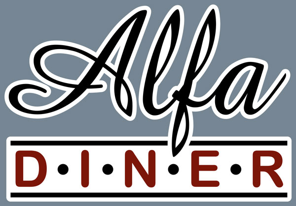
Alpha Diner was a little breakfast place near Tunney’s Pasture, that closed up a few years back. I miss Danny and his mom & dad. They were the ultimate mom&pop place for simple eggs, bacon, coffee and toast … although I don’t do toast or bacon.

This design above was for the web site I built for them [2009ish]. They had so many designs for this place. There was one on the menu and at least 5 more hangin’ around the place. I took photos of them all and taking the best, made this version. There never was anything official for branding but it was the sort of place it didn’t matter. Danny was happy with every version, as long as the name was spelled right.

The site was one of my first and was built in WordPress. It had directions, the phone number and the menu. That’s it.

I was just thinking about the place yesterday [Groundhog Day]. Alpha’s disappeared in a real estate buy-up.

Digital Means Flexible

Vector Butterfly black
Vector Butterfly blue
Vector Butterfly green
Vector Butterfly red

[school assignment ~2007]

Being able to produce artwork quickly in digital means being able to change your mind as quickly as you work. It’s a freedom that has accelerated production of finished premium artwork.

Working in black & white means flexibility in colour choices, adjustable size and seeing your work in finished format on web and printing to paper to see immediately what is good and what isn’t.

Even just 20 years ago, choices in typography meant you had to choose upfront on size, font families, line spacing; send it to the type house to get set into galleys of text to be pasted up on art board to photograph to film for print. A long and expensive route to finished product.

I started in the time of true cut & paste, photo stats, rubylith and camera tricks. This digital stuff is such an improvement in many ways, but it won’t replace the sketch & think for day-dreaming ideas.

Flying an Object along a Path in Illustrator

Lord of the Flies

Here is another school project using Illustrator’s follow path. We were to design a book cover for one of five famous books. My choice was “The Lord of the Flies”. After choosing and placing the text font, converting to outlines and creating some swashes, I made an outline using the offset path on the group of outlined text. I then drew just one fly, made it a library object and had it randomly space and spin around the path. One larger fly at the end of the R’s swash and I was done.

…and of course with Illustrator you can adjust the number, scale, distance and rotation along the path “on the fly”. 😉

I should have left the assignment there, but I overdid it and did an illustration in Photoshop of the the boar’s head from the story. The digital painting wasn’t bad, it was just too much, now that I look back.

Lord of the Flies Boar''s Head

As you can see the mockup cover was too busy and too dark. It would have been far better to just rely on the strength of the typography.

LOTF cover