3D or not 3D? That Raised the Question…

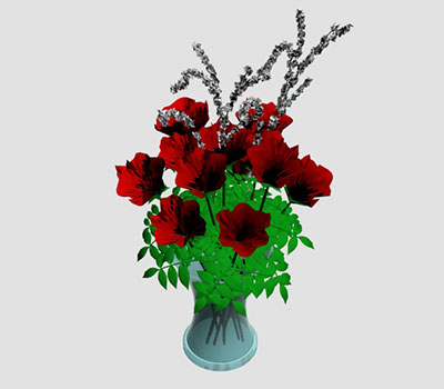
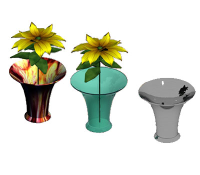
After my stint at college, I got a work placement doing 3D work. I had taken a class in Maya [Autodesk] as an introduction to animation and 3D drawing. I had blueprint and drafting experience so it felt like a good next step.

I did walk cycles and some learned camera and lighting and created a few things that got me interested. Exporting out of Illustrator, I could create 3D text. Every direction was opportunity.

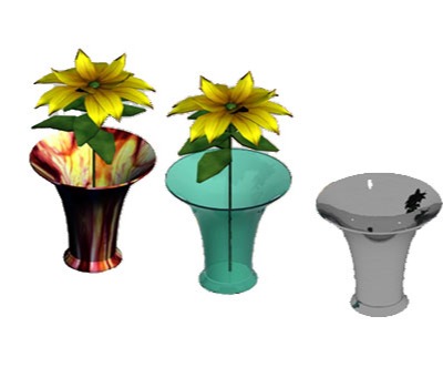
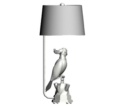
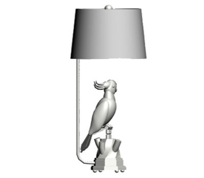
The placement turned out to be using 3D Studio [also by Autodesk], so I dug in and learned enough to create some decorative artifacts for the building models.

With what I knew about Illustrator and AutoCad, I eventually learned to build a 3D building for a charity hospital project.
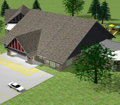
A very busy but awesome summer.

The point here is, it is an incredible way to create. The opportunities in marketing and film production are endless. If things had been a little different, I would have gone into it full speed. But, you know, life is random.

Maya and 3D Studio are the industry standards but they are expensive to own. There are student versions online to learn on. They export with watermarks, so it’s for learning only.

You can learn if you try Blender, which is free. There are tons of tutorials on YouTube to get up to speed. Enjoy the possibilities.

Technical Illustration vs. Life’s Reality

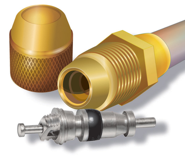
schrader

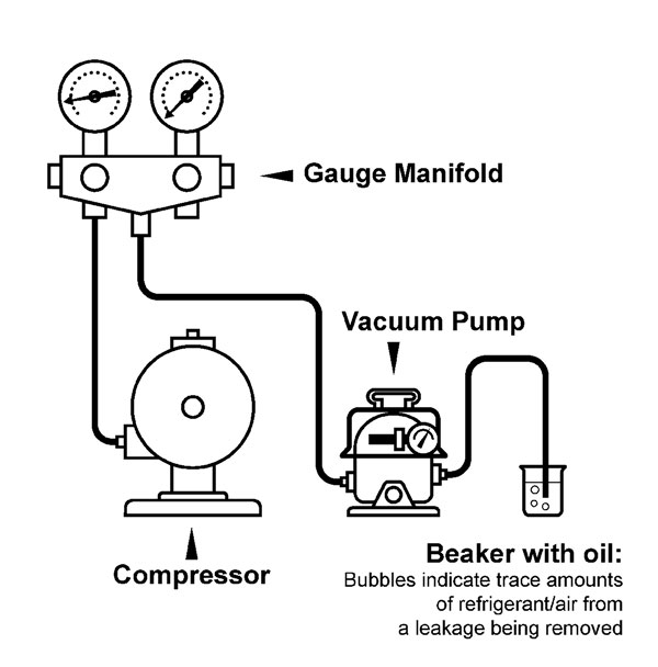
There are illustrations and then there is re-working reality. Representing reality doesn’t have to be totally accurate but in a way, has to look better than the real thing. The ‘rebuilt’ hose and couplings get the point across, but for the lighting to get better would be beyond the scope – and ROI – of the project. The valve has a combination of Illustrator and Photoshop; just enough time was given to clean up the image for a sale.

Could it be more accurate? Of course, but the investment in time against what was paid for the piece would never justify itself.

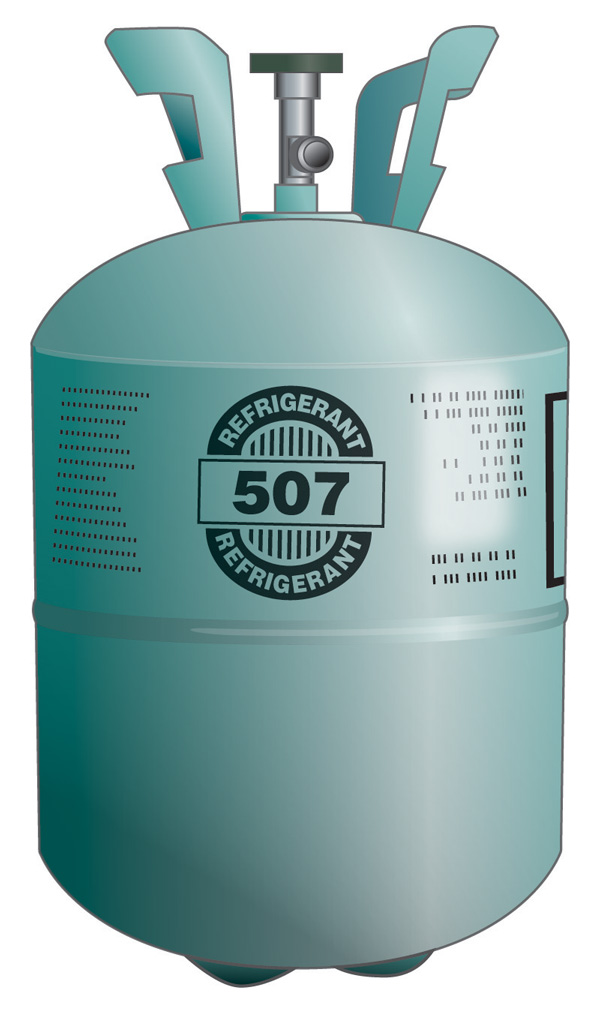
On the cylinder illustration below, the text doesn’t curve exactly right, but at 350 pixels wide, it’s hardly noticeable and not critical. The shadows could be darker, but only on the web. In print, the image will get darker from dot gain, so it’s a good compromise for both.

refrigerant cylinder

Often industrial equipment doesn’t photograph well. Installation instructions are hard to understand from photos.

One of the “bread & butter” ways of illustrating is to make diagrams and drawings of parts that need a near reality image, either for an on-line or print sales catalogue, or for pictorial assembly and operations instruction booklet.

But not too close to reality. You just want to get the point across for the client to see. This is art that isn’t art, but in the eye of the client it should be clean and respecting the product. Assembly drawings should be clear and open so not to clog up during printing; to serve their purpose as information.

It’s important to find that sweet spot of making and selling a technical image & still making a living.

Going Dark Mode

dino-skull in a circle

The newest WordPress version 5.7, with the free theme “Twentig” allows for Dark Mode. The button to switch back and forth between light and dark modes is in the lower right corner.

If you are like me and have light sensitivity issues, this is the easiest way to reduce eye-strain from bright screens.

There are a number of accessibility plugins and options in Windows that I’ve used for a few years and they are awesome for people like me with limited screen time per day.

I will be changing images to allow for better switching, but have started with the banner/footer logo. This might take awhile…

If you know of any useful plugins for better accessibility, please give me a heads-up using the “Say Hello” contact page.