Digital vs. Analog for Colour Control

watercolour - girl skiing

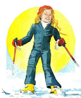
My illustration of the girl skiing was done with mixed-media water colours on art board. It was photographed and film stripped into position. There is a huge loss of detail going from analog work to film to print, You can lose 15-20% detail in a commercial print project from camera work and approximately 18% dot gain in 4-colour CMYK print methods. What you get is “analog generation loss” of quality, controlled mostly by guess work and moderated by experience. Saving old artwork often will mean reworking it digitally if within costs.

The girl skiiing is a scan from the final printed brochure. There is loss of quality and subtlety in the fine detail and in colour print reproduction. Digital work, however remains pristene from origination to press.

Illustrator - Dogwood flower

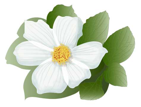
The dogwood flower and leaves were done digitally in Illustrator [Wacom tablet] using vectors to form colour boundaries. The graduations of colour [controlled palette] can be done with gradient fills with complete colour control on all anchor point controls. Digital wins on final controls but the secret is knowing when to stop ‘adjusting’ for best return on a project.

When painting with brushes the fun is in the accidental flow and blending of colours, and digital photography of analog work has come a long way to capture the subtleties of watercolours or any paint medium. Print control of dot gain has come a long way as well to allow better control for print to paper in software such as Adobe InDesign; which has ‘flight controls’ to simulate dot gain on different matt coated or gloss papers.

Chugga – The Little Engine That Couldn’t

overworked engine gif

This was an illustration for a PowerPoint presentation. A simple drawing from Illustrator; exported through Photoshop as multi-layered as an animation. It had to do with machine maintenance and was in the instructional training portion of a manual on compressors, proper use and part upgrade. ~2003.

It started off more “cartoony” but went through several stages. The first versions were too stark and distracting from the content with too much so colour for the motor was changed from red to black to a softer green/blue. Then the implied face was taken out and the animation was simplified.

Final shaded example above is of easy blends in Illustrator and a little blur in Photoshop allowing for simple gif amimation.

It matter of trying to make technical manuals a little more interesting. So I turned to ‘fleshing out’ the forms to make it pop.

Flying an Object along a Path in Illustrator

Lord of the Flies

Here is another school project using Illustrator’s follow path. We were to design a book cover for one of five famous books. My choice was “The Lord of the Flies”. After choosing and placing the text font, converting to outlines and creating some swashes, I made an outline using the offset path on the group of outlined text. I then drew just one fly, made it a library object and had it randomly space and spin around the path. One larger fly at the end of the R’s swash and I was done.

…and of course with Illustrator you can adjust the number, scale, distance and rotation along the path “on the fly”. 😉

I should have left the assignment there, but I overdid it and did an illustration in Photoshop of the the boar’s head from the story. The digital painting wasn’t bad, it was just too much, now that I look back.

Lord of the Flies Boar''s Head

As you can see the mockup cover was too busy and too dark. It would have been far better to just rely on the strength of the typography.

LOTF cover