
The little logo is from the first time I got a chance to revamp the CREA Statistics pages.
Originally, that was all I was asked to do, but of course I wanted to prove I could do at least one better. The stats pages consisted of about fifteen board member statistics from various associations and boards from across Canada, comprising the “meat ‘n taters” of local real estate sales. It looked something like this…
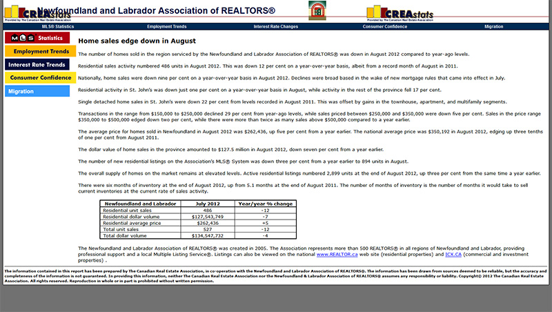
It was early stages and it had all the information promised, but it didn’t ‘sparkle’. There wasn’t proper branding. People couldn’t find the facts easily and the boards wanted a bigger exposure. The hodge-podge of colour and icons was distracting, but such was the days of early HTML. This version had stuck around a little too long.
My director asked for an single icon for the upper banner.
So, I took it upon myself and with the help of a couple of colleagues, rebuilt the thing from the ground up to make it more visual and with some up-to-date code and some re-use of some illustrations I had done for other CREA sites. There was so many sites, but that would have to change later.
Update No. 1
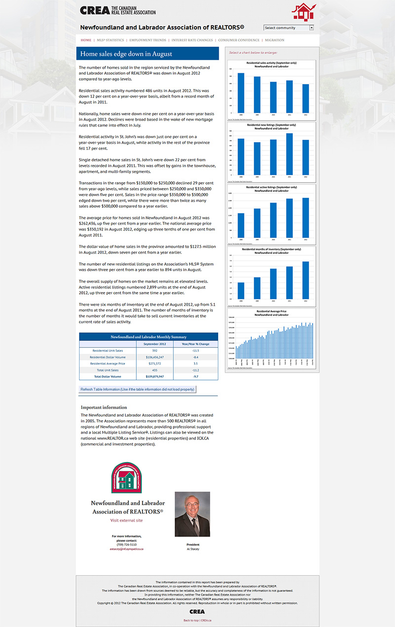
(click on image for full page)
With cleaner banner and icon in place, I added some graphs that could be updated by the stats deptartment. Building on the last build, I recoded and rebuilt it myself so text could also be supplied by the local association and uploaded to their folders. No compromise! I taught the stats-dept to update the separate data-text files and voilà, the pages could be updated far easier, with the help of some CSS2 and JavaScript to pull the text and graphs in and into place. The graphs could be clicked on and pop-up in larger detail. The headlines and text would all fit in. However it wasn’t long before it become a little rusty as well. CREA Stats was it’s own site and the next step was to make it even easier to update content, encorporate as part of the entire CREA site experience, as a whole and the best part… it would be responsive.
Updated Again
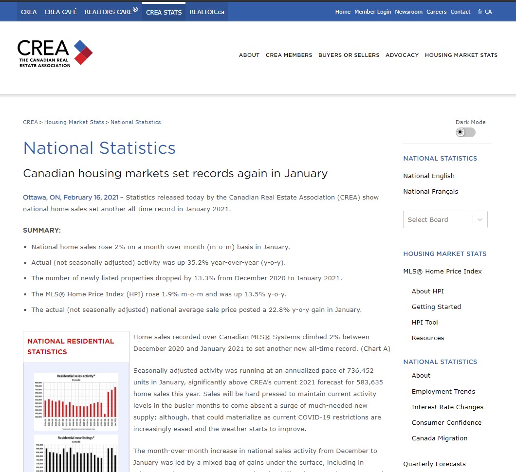
More Board Stats Here…
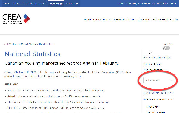
The graphs have gone to the left and still pop up larger in the centre to view. The editing for the stats-dept is even easier with some redefining of the folder structure, some updated JavasScript, CSS3 and HTML5. The “Dark Mode” was added and code updated recently (not by me), but the layout is pretty much the same. (I would have liked to see the pulldown brightly coloured and using ‘focus’ code, but I don’t get to play with it anymore)
The top header defines access to all the CREA web sites in one place for a unified responsive ‘power’ site.
The main page is the National at https://creastats.crea.ca/en-CA/ or Français at https://creastats.crea.ca/fr-CA/. The right column has the same pulldown to get at all the individual boards and associations from across Canada that have since joined the stats pages. It started out as less than 20 and bloomed to over 65 boards showing their stuff on over 500 pages.