Technical Illustration vs. Life’s Reality

schrader

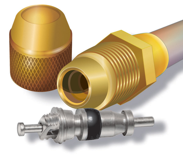
There are illustrations and then there is re-working reality. Representing reality doesn’t have to be totally accurate but in a way, has to look better than the real thing. The ‘rebuilt’ hose and couplings get the point across, but for the lighting to get better would be beyond the scope – and ROI – of the project. The valve has a combination of Illustrator and Photoshop; just enough time was given to clean up the image for a sale.

Could it be more accurate? Of course, but the investment in time against what was paid for the piece would never justify itself.

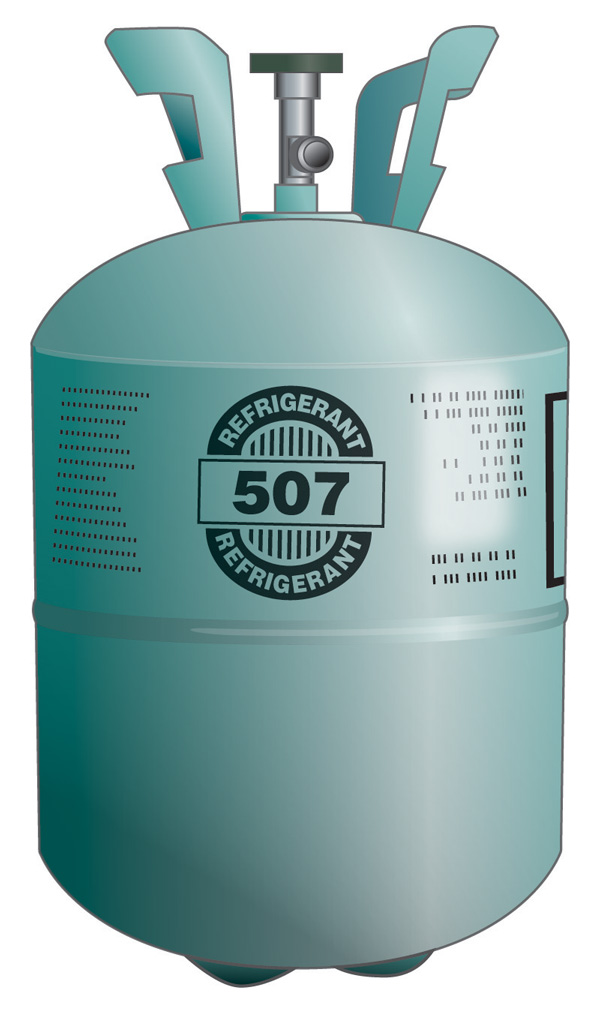
On the cylinder illustration below, the text doesn’t curve exactly right, but at 350 pixels wide, it’s hardly noticeable and not critical. The shadows could be darker, but only on the web. In print, the image will get darker from dot gain, so it’s a good compromise for both.

refrigerant cylinder

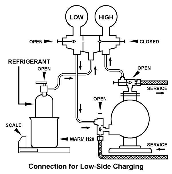
Often industrial equipment doesn’t photograph well. Installation instructions are hard to understand from photos.

One of the “bread & butter” ways of illustrating is to make diagrams and drawings of parts that need a near reality image, either for an on-line or print sales catalogue, or for pictorial assembly and operations instruction booklet.

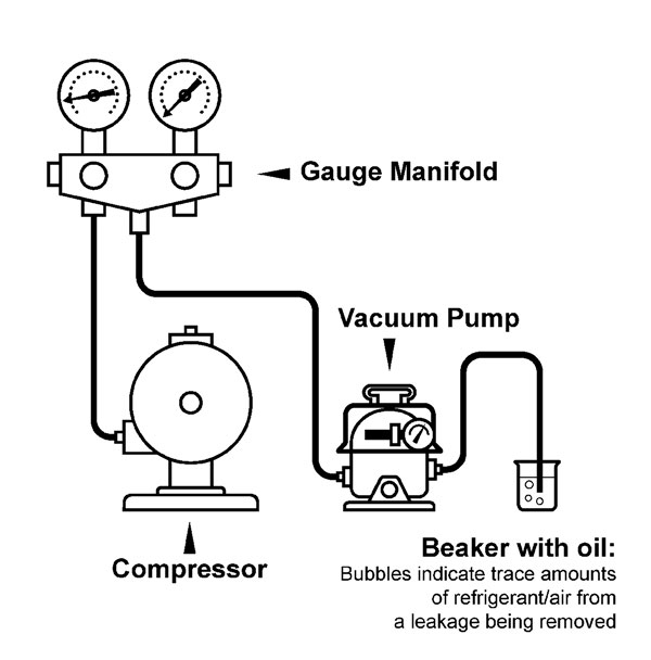
But not too close to reality. You just want to get the point across for the client to see. This is art that isn’t art, but in the eye of the client it should be clean and respecting the product. Assembly drawings should be clear and open so not to clog up during printing; to serve their purpose as information.

It’s important to find that sweet spot of making and selling a technical image & still making a living.

Playing Chicken With Drew

Caution: Strobe effect – may cause headaches. Oh……. I slowed it down. You should be ok now.

Drew Nelson Drewster gif

Drew Nelson is drewnelson.ca

The ‘Drewster’ was one of those sketch to illustrations from so long ago and probably one of the first digital drawings I did. So… probably before most of you wore pants. The Illustrator drawing above has been tweeked with a somewhat new background and turned into an animated gif in Photoshop.

Drew is an Canadian blues singer and guitarist extraordinaire. Support your local artists, people!

They may not be there when we get back to new-nornal.

Digital Means Flexible

Vector Butterfly black
Vector Butterfly blue
Vector Butterfly green
Vector Butterfly red

[school assignment ~2007]

Being able to produce artwork quickly in digital means being able to change your mind as quickly as you work. It’s a freedom that has accelerated production of finished premium artwork.

Working in black & white means flexibility in colour choices, adjustable size and seeing your work in finished format on web and printing to paper to see immediately what is good and what isn’t.

Even just 20 years ago, choices in typography meant you had to choose upfront on size, font families, line spacing; send it to the type house to get set into galleys of text to be pasted up on art board to photograph to film for print. A long and expensive route to finished product.

I started in the time of true cut & paste, photo stats, rubylith and camera tricks. This digital stuff is such an improvement in many ways, but it won’t replace the sketch & think for day-dreaming ideas.